 Buy now
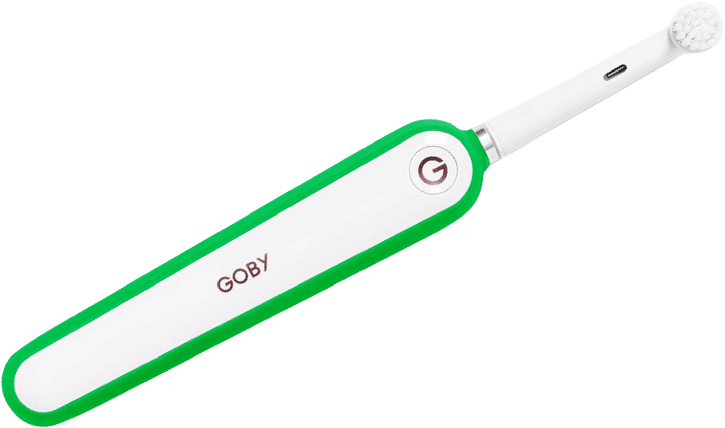
Hotspots
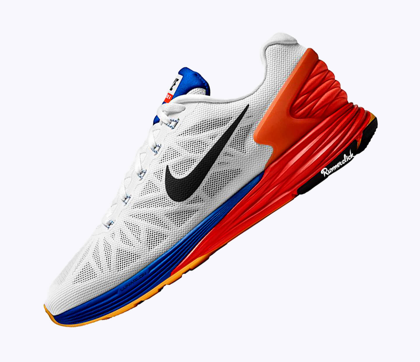
Create an image with interactive hotspots that show hidden description on hover.
Around component
Basic example
<!-- Hotspots -->
<div id="hotspots-container-1" class="cs-hotspots">

  <!-- Image -->
  <img src="path-to-image" alt="Image with hotspots"/>

  <!-- Hotspot -->
  <span class="cs-hotspot" style="top: 56%; right: 34%;" data-container="#hotspots-container-1" data-toggle="popover" data-placement="top" data-trigger="hover" title="Soft foam base" data-content="Vivamus sagittis lacus vel augue laoreet rutrum faucibus ornare sem."></span>

  <!-- Hotspot -->
  <span class="cs-hotspot" style="top: 15%; left: 40%;" data-container="#hotspots-container-1" data-toggle="popover" data-placement="bottom" data-trigger="hover" title="Durable materials" data-content="Vivamus sagittis lacus vel augue laoreet rutrum faucibus ornare sem."></span>

  <!-- Hotspot -->
  <span class="cs-hotspot" style="top: 56%; left: 21%;" data-container="#hotspots-container-1" data-toggle="popover" data-placement="top" data-trigger="hover" title="Top-notch ergonomics" data-content="Vivamus sagittis lacus vel augue laoreet rutrum faucibus ornare sem."></span>
</div>
// Hotspots
#hotspots-container-1.cs-hotspots
// Image
+image("path-to-image", "Image with hotspots").rounded-lg
// Hotspot
span(style="top: 56%; right: 34%;", data-container="#hotspots-container-1", data-toggle="popover", data-placement="top", data-trigger="hover", title="Soft foam base", data-content="Vivamus sagittis lacus vel augue laoreet rutrum faucibus ornare sem.").cs-hotspot
// Hotspot
span(style="top: 15%; left: 40%;", data-container="#hotspots-container-1", data-toggle="popover", data-placement="bottom", data-trigger="hover", title="Durable materials", data-content="Vivamus sagittis lacus vel augue laoreet rutrum faucibus ornare sem.").cs-hotspot
// Hotspot
span(style="top: 56%; left: 21%;", data-container="#hotspots-container-1", data-toggle="popover", data-placement="top", data-trigger="hover", title="Top-notch ergonomics", data-content="Vivamus sagittis lacus vel augue laoreet rutrum faucibus ornare sem.").cs-hotspot
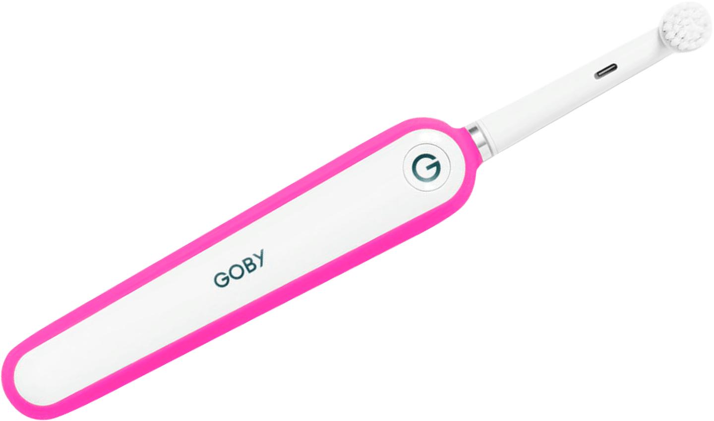
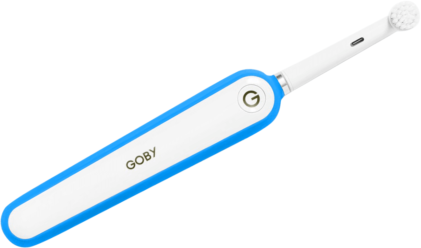
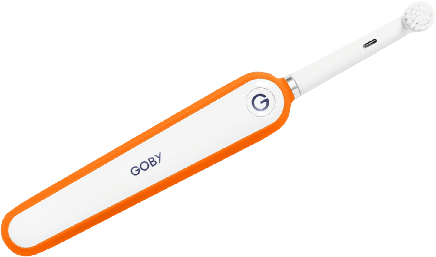
Combine with color switcher
<!-- Combine hotspots with color switcher -->
<div class="cs-hotspots" id="hotspots-container-2">

  <!-- Image (radio) tabs -->
  <div class="radio-tab-pane active" id="pink" role="tabpanel">
    <img src="path-to-first-image" alt="Image"/>
  </div>
  <div class="radio-tab-pane" id="blue" role="tabpanel">
    <img src=".path-to-second-image" alt="Image"/>
  </div>
  <div class="radio-tab-pane" id="orange" role="tabpanel">
    <img src="path-to-third-image" alt="Image"/>
  </div>
  <div class="radio-tab-pane" id="green" role="tabpanel">
    <img src="path-to-fourth-image" alt="Image"/>
  </div>

  <!-- Hotspot -->
  <span class="cs-hotspot" style="top: 58%; right: 50%;" data-container="#hotspots-container-2" data-toggle="popover" data-placement="top" data-trigger="hover" title="Soft anti-slip grip" data-content="Vivamus sagittis lacus vel augue laoreet rutrum faucibus ornare sem."></span>

  <!-- Hotspot -->
  <span class="cs-hotspot" style="top: 22%; right: 38%;" data-container="#hotspots-container-2" data-toggle="popover" data-placement="top" data-trigger="hover" title="Power button with 3 modes" data-content="Vivamus sagittis lacus vel augue laoreet rutrum faucibus ornare sem."></span>

  <!-- Hotspot -->
  <span class="cs-hotspot" style="top: 17%; right: 17%;" data-container="#hotspots-container-2" data-toggle="popover" data-placement="bottom" data-trigger="hover" title="Interchangeable head" data-content="Vivamus sagittis lacus vel augue laoreet rutrum faucibus ornare sem."></span>

  <!-- Hotspot -->
  <span class="cs-hotspot" style="top: 77%; left: 8%;" data-container="#hotspots-container-2" data-toggle="popover" data-placement="top" data-trigger="hover" title="Powerful Li-ion battery" data-content="Vivamus sagittis lacus vel augue laoreet rutrum faucibus ornare sem."></span>
</div>

<!-- Color radio buttons -->
<div class="text-center pt-grid-gutter">
  <div class="d-inline-flex bg-light rounded py-2 px-3">

    <!-- Radio -->
    <div class="custom-control cs-custom-color-option custom-control-inline mx-1 my-1">
      <input class="custom-control-input" type="radio" name="color" id="c-pink" value="Pink" checked>
      <label class="cs-custom-option-label" for="c-pink" data-toggle="radioTab" data-target="#pink" data-parent="#hotspots-container-2">
        <span class="cs-color-swatch" style="background-color: #ff3dbe;"></span>
      </label>
    </div>

    <!-- Radio -->
    <div class="custom-control cs-custom-color-option custom-control-inline mx-1 my-1">
      <input class="custom-control-input" type="radio" name="color" id="c-blue" value="Blue">
      <label class="cs-custom-option-label" for="c-blue" data-toggle="radioTab" data-target="#blue" data-parent="#hotspots-container-2">
        <span class="cs-color-swatch" style="background-color: #00a1f0;"></span>
      </label>
    </div>

    <!-- Radio -->
    <div class="custom-control cs-custom-color-option custom-control-inline mx-1 my-1">
      <input class="custom-control-input" type="radio" name="color" id="c-orange" value="Orange">
      <label class="cs-custom-option-label" for="c-orange" data-toggle="radioTab" data-target="#orange" data-parent="#hotspots-container-2">
        <span class="cs-color-swatch" style="background-color: #fa6000;"></span>
      </label>
    </div>

    <!-- Radio -->
    <div class="custom-control cs-custom-color-option custom-control-inline mx-1 my-1">
      <input class="custom-control-input" type="radio" name="color" id="c-green" value="Green">
      <label class="cs-custom-option-label" for="c-green" data-toggle="radioTab" data-target="#green" data-parent="#hotspots-container-2">
        <span class="cs-color-swatch" style="background-color: #00b22c;"></span>
      </label>
    </div>
  </div>
</div>
// Combine hotspots with color switcher
#hotspots-container-2.cs-hotspots
// Image (radio) tabs
#pink.radio-tab-pane.active(role="tabpanel")
+image("path-to-first-image", "Image")
#blue.radio-tab-pane(role="tabpanel")
+image("path-to-second-image", "Image")
#orange.radio-tab-pane(role="tabpanel")
+image("path-to-third-image", "Image")
#green.radio-tab-pane(role="tabpanel")
+image("path-to-fourth-image", "Image")
// Hotspot
span(style="top: 58%; right: 50%;", data-container="#hotspots-container-2", data-toggle="popover", data-placement="top", data-trigger="hover", title="Soft anti-slip grip", data-content="Vivamus sagittis lacus vel augue laoreet rutrum faucibus ornare sem.").cs-hotspot
// Hotspot
span(style="top: 22%; right: 38%;", data-container="#hotspots-container-2", data-toggle="popover", data-placement="top", data-trigger="hover", title="Power button with 3 modes", data-content="Vivamus sagittis lacus vel augue laoreet rutrum faucibus ornare sem.").cs-hotspot
// Hotspot
span(style="top: 17%; right: 17%;", data-container="#hotspots-container-2", data-toggle="popover", data-placement="bottom", data-trigger="hover", title="Interchangeable head", data-content="Vivamus sagittis lacus vel augue laoreet rutrum faucibus ornare sem.").cs-hotspot
// Hotspot
span(style="top: 77%; left: 8%;", data-container="#hotspots-container-2", data-toggle="popover", data-placement="top", data-trigger="hover", title="Powerful Li-ion battery", data-content="Vivamus sagittis lacus vel augue laoreet rutrum faucibus ornare sem.").cs-hotspot
// Color radio buttons
.text-center.pt-grid-gutter
.d-inline-flex.bg-light.rounded.py-2.px-3
// Radio
.custom-control.cs-custom-color-option.custom-control-inline.mx-1.my-1
input(type="radio", name="color", id="c-pink", value="Pink", checked).custom-control-input
label(for="c-pink", data-toggle="radioTab", data-target="#pink", data-parent="#hotspots-container-2").cs-custom-option-label
span(style="background-color: #ff3dbe;").cs-color-swatch
// Radio
.custom-control.cs-custom-color-option.custom-control-inline.mx-1.my-1
input(type="radio", name="color", id="c-blue", value="Blue").custom-control-input
label(for="c-blue", data-toggle="radioTab", data-target="#blue", data-parent="#hotspots-container-2").cs-custom-option-label
span(style="background-color: #00a1f0;").cs-color-swatch
// Radio
.custom-control.cs-custom-color-option.custom-control-inline.mx-1.my-1
input(type="radio", name="color", id="c-orange", value="Orange").custom-control-input
label(for="c-orange", data-toggle="radioTab", data-target="#orange", data-parent="#hotspots-container-2").cs-custom-option-label
span(style="background-color: #fa6000;").cs-color-swatch
// Radio
.custom-control.cs-custom-color-option.custom-control-inline.mx-1.my-1
input(type="radio", name="color", id="c-green", value="Green").custom-control-input
label(for="c-green", data-toggle="radioTab", data-target="#green", data-parent="#hotspots-container-2").cs-custom-option-label
span(style="background-color: #00b22c;").cs-color-swatch